
SHADES OF PURPLE: NAMES, HEX CODES AND MIXING IDEAS
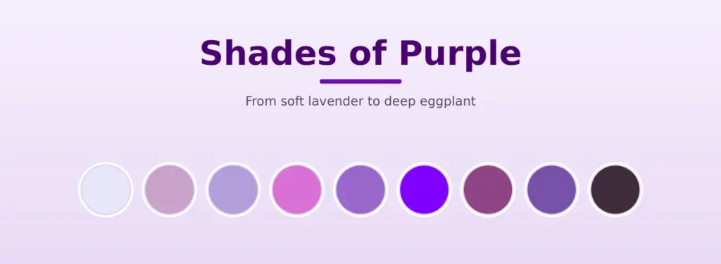
QUICK ANSWER: Purple appears in dozens of named variations. In this guide, we organize the commonly used purples into four practical groups: light, bright, warm or muted, and dark. For each one you get its name, a reference hex code, and a simple mixing idea, plus a link to its own guide when you want detailed steps.
Most purple paint variations grow from a clean red-and-blue mixture, though the best starting pigments and ratios depend on the color you are aiming for. Digital purples are specified through numeric color values rather than physical pigment mixtures. Below you get a full reference chart, then each shade grouped by family with a short mixing idea and a link to its guide.
What Are the Shades of Purple?
A purple shade is any color in the purple range that differs in lightness, saturation, or color bias. Adding white creates a lighter tint, while black or another darkening color lowers the value. Gray or a small amount of a complementary color reduces saturation. Shifting the mixture toward red gives a warmer purple, while moving it toward blue gives a cooler one.
A quick note on the word shade. In everyday use, shade means any variation of purple. In traditional color theory the term is narrower, since a shade is made by adding black, while white creates a tint and gray creates a tone. This page uses shade in the everyday sense unless it says otherwise.
Purple Shade Chart
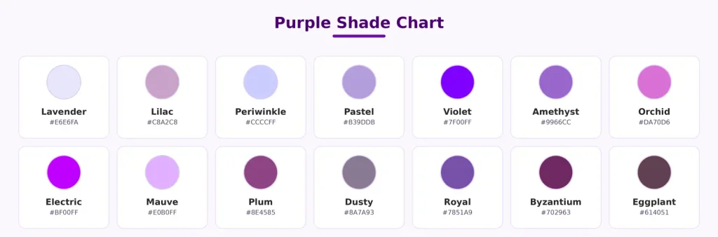
Color names do not always have one universal digital value, so the codes below are practical reference values selected for this guide. Where a name is also defined by CSS, the official CSS value is noted after the chart.
| Shade | Reference Hex | Value | Temperature | Saturation |
| Lavender | #E6E6FA | Light | Cool | Soft |
| Lilac | #C8A2C8 | Light | Warm | Soft |
| Periwinkle | #CCCCFF | Light | Cool | Soft |
| Pastel Purple | #B39DDB | Light | Cool | Soft |
| Violet | #7F00FF | Medium | Cool | Vivid |
| Amethyst | #9966CC | Medium | Cool | Medium |
| Orchid | #DA70D6 | Medium | Warm | Vivid |
| Electric Purple | #BF00FF | Medium | Cool | Vivid |
| Mauve | #E0B0FF | Light | Warm | Clear |
| Plum | #8E4585 | Dark | Warm | Muted |
| Dusty Purple | #8A7A93 | Medium | Neutral | Muted |
| Royal Purple | #7851A9 | Medium-dark | Cool | Medium |
| Byzantium | #702963 | Dark | Warm | Medium |
| Eggplant | #614051 | Dark | Warm | Muted |
Some of these names are also defined in CSS with different values. The CSS named violet is #EE82EE and the CSS named plum is #DDA0DD, both lighter than the vivid values above. Lavender and orchid match their CSS values, while lilac, mauve, dusty purple, royal purple, Byzantium, and eggplant have no official CSS value, so those codes are practical reference values.
NOTE: Paint recipes on this page are visual starting points and will not automatically reproduce the exact digital hex value. Test a swatch and adjust it under the lighting in which the finished work will be viewed.
How We Selected the Reference Codes
CSS-defined colors use the official W3C values. For names without a CSS definition, we chose widely used digital references and checked that each value visually matched the description on this page. These codes are practical starting points rather than universal standards.
You can compare the standardized browser color names in the W3C CSS Color specification.
How to Mix Any Shade of Purple
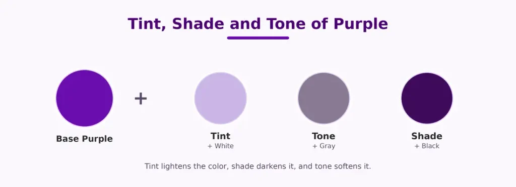
Most paint variations come from four adjustments: changing the red-to-blue balance, adding white, deepening the mixture, or reducing its saturation. Adding white lightens the purple into a tint, toward lavender and lilac. Gray reduces saturation, softening it toward dusty purple. For depth, a deeper purple pigment lowers the value while keeping more saturation, ultramarine shifts the mix toward a darker and cooler purple, and a small amount of black gives a more neutral result. Dioxazine purple is a ready-made, highly tinting deep violet paint, so use it sparingly.
NOTE: Mixing tip. For a clean base purple, use a blue-biased red such as quinacridone magenta (PR122) with a red-biased blue such as ultramarine (PB29). A muddy base makes every shade look dull, so start clean.
Light Shades of Purple
Light purples are tints, made by adding white to a base purple, sometimes with a small shift toward blue or pink. They are commonly used when a palette needs a soft or delicate appearance, such as in decor, weddings, and pastel designs.
Lavender
Lavender is a soft, cool light purple with a slight blue lean, reference hex #E6E6FA, which is also its CSS value. Mix purple with plenty of white and a hint more blue. See the full recipe in the lavender guide.
Lilac
Lilac is warmer and slightly pinker than lavender, reference hex #C8A2C8. Start with a light purple tint, then add magenta in tiny amounts. If it looks dull rather than softly muted, the base may contain too much grey. See the lilac guide.
Periwinkle
Periwinkle sits between blue and purple, reference hex #CCCCFF. It leans more blue than most purples, so add a little extra blue and white to your base.
Pastel Purple
Pastel purple is any soft, low-saturation light purple, reference hex #B39DDB. Add white, and a tiny bit of gray if it looks too bright. See the light purple guide.
Bright Shades of Purple
Bright purples hold their strength because they use saturated pigment and avoid black. They stand out and are often chosen for accents, art, and bold branding.
Violet
Violet is the bluer, cooler side of purple, shown here as a vivid #7F00FF, while the CSS named violet is a lighter #EE82EE. Add more blue to your base with a red-biased blue like ultramarine. See the violet guide.
Amethyst
Amethyst is a medium, jewel-like purple, reference hex #9966CC. Mix a balanced purple and add a small amount of white for its soft glow.
Orchid
Orchid is a bright purple with a pink lean, reference hex #DA70D6, which matches its CSS value. Shift your base toward magenta for the pink warmth.
Electric or Neon Purple
Electric purple is a highly vivid, blue-leaning purple, shown here with the reference hex #BF00FF. Start with a high-chroma magenta and a red-biased blue, adjusting carefully since a strongly tinting blue can quickly dominate the mix. A true neon or fluorescent look is hard to reach with normal paint and may need fluorescent pigment or a screen. See the bright and neon purple guide.
Warm and Muted Purple Variations
Warm and muted describe different qualities. Warm purples lean toward red or magenta, while muted purples have lower saturation, and some colors such as mauve can show both depending on the reference you pick. These variations read as gentle and elegant, and they suit decor, fashion, and calm palettes.
Mauve
Mauve is shown here in its traditional light-purple form, reference hex #E0B0FF. Create a pale purple with plenty of white, then adjust it slightly toward red. See the mauve guide.
Plum
Plum is a deep, warm red-purple, shown here as #8E4585, while the CSS named plum is a lighter #DDA0DD. Shift your base toward red, then deepen it slightly. See the plum guide.
Dusty Purple
Dusty purple is a muted, grayish purple, reference hex #8A7A93. Add neutral gray for predictable control. If you mute with a complement instead, use only a trace of yellow and test after each addition, since too much turns purple brown. See the dusty purple guide.
Dark Shades of Purple
Dark purples come from deepening the base with blue or a darkening color. They read as rich and formal, and they are often chosen for luxury-inspired or dramatic palettes.
Royal Purple
Royal purple is a rich, deep purple, reference hex #7851A9. Start with a saturated purple and deepen it with a small amount of ultramarine or dioxazine purple. Use black only when a more neutral, less saturated result is fine. See the dark and royal purple guide.
Byzantium
Byzantium is a dark red-purple, reference hex #702963. Shift toward red, then deepen with a small amount of a darkening color.
Eggplant
Eggplant is a very dark, brownish purple, reference hex #614051. Deepen a red-leaning purple, and add only a hint of its complement to reach the earthy depth.
Warm Purple vs Cool Purple
The warmth of a shade comes from its lean. Warm purples appear closer to red or magenta and often create a softer, earthier appearance, like mauve and plum. Cool purples appear closer to blue or violet and tend to look sharper or more vivid, like violet and periwinkle. Choosing the right lean is often more important than choosing light or dark, since it sets the tone of the whole palette.
How to Choose the Right Purple Shade
Pick the shade by the look you want. Light purples like lavender are commonly used for soft, delicate palettes. Bright purples like violet and electric purple draw attention and suit art and bold brands. Warm purples like mauve and plum work well in fashion and interiors. Dark purples like royal purple and eggplant are often chosen for formal or luxury-inspired designs. For screens, copy the reference hex from the chart, and for paint, follow the mixing idea in each shade guide and test a swatch.
Frequently Asked Questions About Shades of Purple
Using the Chart
Use the chart to find the direction of the purple you want, then test the suggested mixture on a small swatch. Remember that hex codes describe screen colors, while paint results vary by pigment, brand, surface, and lighting. For measured steps on any color, continue to its dedicated guide.
NOTE: Written and reviewed by Zohan, founder and editor of How to Make Purple. He researches practical color mixing for painting and digital design and reviews each guide using pigment information and established digital color references.
Last reviewed: October 16, 2026.